I never had it easy with distress inks and used to watch other crafters blend colors seamlessly in awe. Everyone advised ‘not putting pressure’ and practice as key to doing it perfectly. But I figured the actual answer – let your sponge get seasoned with lots of ink. So when u practice, the sponge soaks in the ink and makes the application uniform. I started using distress inks about 4 months back and they are finally good to me now!
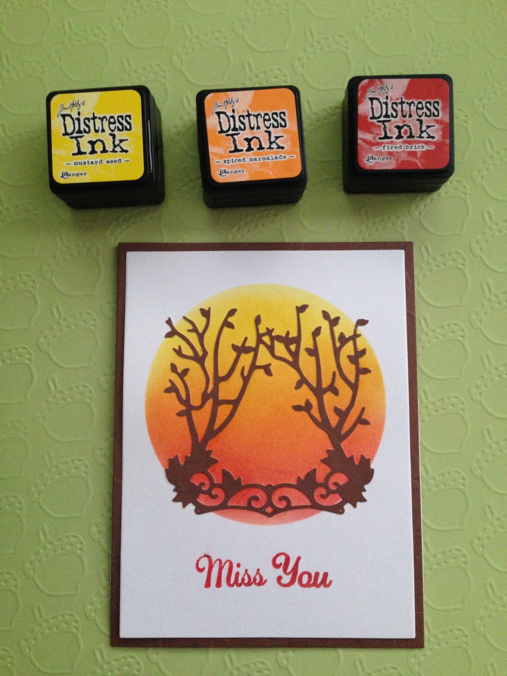
I die cut a circle on a piece of paper and used it as a stencil to make this ombré effect. The distress inks used are mentioned in the supplies list below.A close look to see the colors blend into each other..

The entire card..
Supplies used:
1. 65lb Recollections® White Card stock paper
2. Pattern paper from CraftSmith® – ‘Fall Embossed’
3. Color Box® Petal point : Pigment inks
4. Clear stamps from Hampton art® (Sentiments)
5. Tim Holtz® Distress inks – Mustard seed, Spiced Marmalade, Fired Brick
6. Die from in’spire by Spellbinders® – Twigs Unite
I would like to enter this card in following challenges:
- Less is More – Celebrating a 6th Birthday!
- Simon Says Stamp Wednesday Challenge: The Color Of Love
- SSS Work it Wednesday January 2017
- Crafty Creations Challenge #334 – Anything goes
Thank you! 🙂

You’ve definitely cracked it! Looks lovely! X
LikeLiked by 1 person
Yep, beautifully blended and a lovely finished card.
LikeLiked by 1 person
Thankyou! 😊
LikeLike
A fabulous tip for distress inks which we often forget to mention until we need to start a new sponge! Fabulous inky blending here and a gorgeous design and choice of colours. Thanks so much for playing along in our 6th birthday challenge at Less is More this week. Sarah
LikeLiked by 1 person
You have definitely achieved a perfect blend here – love the warm sunset colours too! A really striking CAS design. Thank you for joining us at Less is More this week 🙂
LikeLiked by 1 person
Your card is fab, loving the colours you’ve chosen. I wash my sponges out between uses … but my tip is to put one layer of colour down (lightly) not worrying about lines and then go back with a second layer and blend away the lines but … it’s whatever works for the individual and you have certainly cracked this technique
Kathyk
LikeLiked by 1 person
Thank you 😊
LikeLike
Absolutely beautiful – love this design and your choice of colours.
Thanks so much for playing along this week at Simon Says Stamp Wednesday Challenge.
Hugs,
Caryn xxx
LikeLiked by 1 person
Beautiful
LikeLiked by 1 person
gorgeous card!! love the ink blending
LikeLiked by 1 person
What a fab card – such lovely ink blending! Great choice of vibrant colours, and the die cut overlays look super. Thanks so much for playing along with us at Less is More 🙂
LikeLiked by 1 person
You’ve achieved a really dramatic look with that incredible blending with your distress inks. I’d say you have mastered the technique now. Love those hot colours with the brown in the foreground. Fab card. Thanks so much for sharing this with us at Less is More xx
LikeLiked by 1 person
Loved making the card, thank you for the challenge!
LikeLike